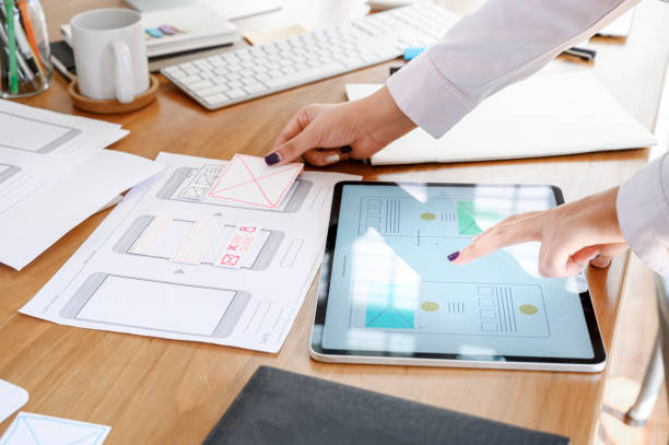
Web designing and development is the process of planning, arranging and conceptualizing content online. Nowadays, web designing goes beyond aesthetics to include the website’s overall functionality. Web development also includes web apps, user interfaces and mobile app designs.
Choosing a Web Design Tool
Website designing has two main ways:- First is using a desktop app and secondly using a website builder. You can choose any method, which should rely on your team size, your budget, the type of site you wish to build and its technical requirements.
- Desktop Apps:- Desktop apps require designers to create their design and send it to a development team, who can convert it into a design code. The most popular desktop apps for website designing are photoshop and sketch.
- Website Builders:- Nowadays, there are many website builders on the market. Before using a website builder website, firstly do research on it, experiment on trials and consider which platform best fits for website’s needs.
Web Design Elements
While designing a website, it’s essential to consider both the website’s visibility and functionality. These elements will increase the website’s performance and usability. Website performance is based on ranking, speed, searchability and ability to capture the audience. Website usability includes such as ease to navigate, images, graphics content, and colour scheme.
Visual Elements
Here’s a quick overview, that must be considered while website designing.
- Fonts:- Choose a font that compliments your website design. Font should be paired with your colour scheme, images, and graphics and give strength to your website design.
- Colour:- Colors are the most essential elements when designing a website. Most importantly, always keep in mind there are many misconceptions about the psychology of colour. While website development focuses on the colour that compliments and gives the message you want to convey to your audience.
- Content:- For a website, it’s essential to have expert content writers and designers, who can work together and build attractive designs with balanced elements. Also, if you focus on using text blocks, that will definitely compliment the graphics and images.
- Shapes:- Using Graphic elements in website development can help integrate text and images. This will help the website’s overall appearance. Because combining beautiful colours and images can help to catch the direct attention of visitors to the website.
- Icons & Images:- Attractive designs can communicate a lot of information in a few seconds. This can be possible if we choose powerful images and icons. Choosing relevant images and icons will strengthen your website
Functional Elements
These functional elements are imperative to consider while website development. A website that functions properly is essential for high ranking on SERP and gives the best experience to users.
- Site Structure:- A website structure plays a crucial role in both user experience and SEO. Users should be easily navigated through the website without issues. Poor navigation can lead to a bad user experience (UX)and website ranking (SEO).
- Website Speed:- No one in this world like a slow website. Having a wait of more than a few seconds for a page to load can deter a visitor from remaining or returning to your website. Make sure your website loads quickly.
- Animation:- There are tons of animation techniques, that can help you get visitors’ attention and interact with your website. For beginners in web development, we recommend keeping your website animation simple.
- user-interaction:- Website visitors have many ways to interact with your website. The best website simplifies a few interactions like making sure all forms are mobile-friendly, avoiding pop-ups, and Never autoplay videos.
Types of Website Design:-Adaptive and Responsive
There are many pros and cons of an adaptive and responsive website that will help you determine which will work best for your website development. You definitely came across the multiple different website designs. Moreover, we are in a mobile-centric world, there are only two website styles: Adaptive and Responsive
Adaptive Website
An adaptive website can be split into two categories, it will be based on the size that needs to be displayed. Adaptive websites based on device type and knowing what version of the site to display on the device is trying to reach it.(i.e. desktop, mobile,tablet)
Furthermore, instead of using “user-agent” website can have 1080px, 768px and 480px width version. This will more flexible while designing a website and good viewing experience when the website will adapt based on screen width.
Responsive Website
A responsive website is which response to the device it’s being viewed on. responsive website development allows you to create a website that reacts dynamically. When a user clicks on website links from a desktop, mobile or tablet, the website quickly responds to being viewed and provides the best experience for that device. The main reason to choose a responsive website, it will deliver on its objectives- SERP, usability, content and conversion optimisation.
In addition, it’s important if website developers include both features adaptive and responsive. That will allow your content to act responsively even though the website itself is still adaptive


